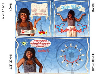
1)
2)
3)
 All the above are successful digipaks, therefore as something to learn from i have found one not so successful.
This one isn't as effective due to the fact that it's so plain, and in my opinion the artist doesn't have a particular genre which she is representing. The colour scheme is boring, plain purple, and there isn't enough going on, even though some simple ones work well too. I feel like not enough effort has been put in. Also another big no no is to stretch your images which is what this grop has done, so it makes your artist look less attractive and thicker which isn't needed.


No comments:
Post a Comment