
Showing posts with label Samarge Hamilton. Show all posts
Showing posts with label Samarge Hamilton. Show all posts
Friday, 27 January 2012

Evaluation 4
The other person I had to review my music video was Nathan and he said that the dancing was well executed and it was well die however because of the equipment we has student video wasn't going to be all that so the camera lighting was off a little so if had the chance to do this again I feel that my group will try to get the lighting right because there is little room for error with the type of camera we have got. I also learnt that a load of people enjoyed the video there was not much bad things that people had to say mostly praises therefore I feel my group done a really good job


This is Jazz talking about my digipak via blackberry messenger, as Jazz did not want to be filmed we decided we would use a different method to get her feedback. Well she notice that there was a link between the two products which is exactly what I was trying to achieve. Also she felt that the font and colours were effective which again was good to hear. However there was no real constructive criticism that I could take on board but we are meant to answer what we learnt from our audience feedback well I learn that Jazz really liked this design and colours and font and sometimes to one person that digipak and poster may just be perfect but to others it may be totally rubbish but this person really like it. I learnt also that following the guide lines given to us has made the target audience like the product which is the main thing.

Tuesday, 24 January 2012
Friday, 20 January 2012
Friday, 13 January 2012
Feedback On My Advert
This is kaylah giving me feed back on my advert!
Couple of things she said was very true for example, the logo's of my digipak are squashed together because I was trying to fit them all in on the page, and make them look tidy but that was not so successful. Kaylah also did not like the way the album was positioned and I understand where she is coming from. The digipak is at an angel that you have to tilt your head so this make looking at the digipak awkward. Also the tour date again tilted which can be improved by straightening them up so if I had more time I would of tired to address these problems.
The Technologies I Plan To Use
This was meant to be a video but since the internet server will not upload the video clip from the flip camera I will have to write it out.
I plan to use many video's and little writing because i'm trying to get across the point of using multiple technologies and there is more than one way of presenting the answers to the questions.
I also plan to use prezi instead of writing a whole load and showing so much screen shots I will put them on a prezi with my video with my writing so im using one technology as a box to carry others.
Also I will sign up to slide share for my presentation I could just take pictures and screen shots but I thought it would be better if it was in a moving type of program.
Photo bucket, Survey monkey are two of the other online sites I have signed up to in order to present the information in a technological way and i feel using these programs i will have taken on board what the teachers have said and hopefully boost my grade higher.
Thursday, 12 January 2012
Evaluation Introduction
We was given an introduction on how to do evaluation which is worth 20marks which is a very big part of our coursework grade.


The above images are type of ways to present our evaluation and we must try to use as much as we can in order to get maximum marks in our evaluation.


The above images are the evaluation questions 1-4 it states what the question is, things that we should cover when answering the question so another word would be guide lines, and in the last column you see what type of technology you could use.
Completed Advertisement

The second of the ancillary product the poster which promotes the album release.
Completed Digipak

This is my completed digipak which was an acillary product you had to complete for the artist.

This is the inside of the digipak, images and back ground and pictures view-able as I lowered the opacity
ScreenShots Of My Advertisement In The making

This is the process of the advertisement in the making all the pieces come together one after the other.
1. Decided to use the same colour on the album cover for my poster.2. Put on the CD cover and the vital information like the release date with artist name
3. Added some reviews and stars so people know how good it is plus tour dates
4. Added all the logo's of place you can connect the artist or buy the album
Wednesday, 11 January 2012
Sunday, 8 January 2012
ScreenShots Of My Digipak In The making

The process of my digipak in motion
1. Finally picked a colour and design with tiles graphics (first image)2. The two images I thought was best to go on the front cover and the inside (second image)
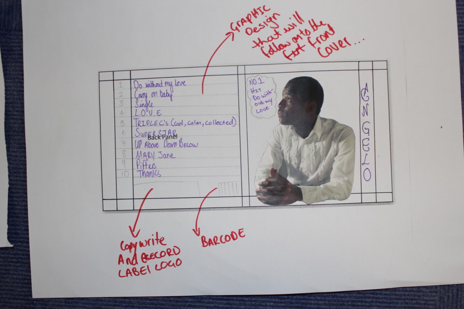
3. All the fine details such as barcode, logo and filled out the spine with contact information (third image)
4. The track-list and name of the artist (fourth image).

The process of the inside of the digipak in motion
1. I decided to keep the graphics throughout the inside the same as the outside (first image)
2. added some pictures and make it blend in with the graphics so you can see both (second image)
3. Added the song informations such as who wrote it and produced by. (third image)
4. Added a circle with a smaller circle inside to show where the CD will be placed.
Thursday, 15 December 2011
Showing Where My Ideas Came From Existing Products

In this poster right here you see the tour dates which I plan to put on my poster because i would want my fans to know when I will be singing the songs from the album. Also to put it on so they know im trying to establish myself in the industry and they can come and support.

On there poster there are loads of logo's I plan to put logo's on my poster as well such as itunes and amazon and hmv places where I can
Overview of Do's and Dont's
We plan to make a professional and genuine digipak, but in order for us to do this to the best of of our ability the teachers gave us a couple of guidelines we should follow in order for it too look professional and slick but realistic and genuine.
Do's
Dont's
Personally, I think this has helped because I can now structure my work professionally and hopefully get top marks for my creative work. I think what was also really helpful is that the guidelines really have a clear focus on how you should produce your work which helps to strengthen your work because you can take a basic, structured idea, and develop it into something that you can be proud of.
Do's
- Use clear fonts and photos in an appropriate size/shape.
- Use a layout that follows the rule of thirds for composition.
- Appropriate font that follows genre conventions; position text to conform to conventions.
- Follow the three colour rule and choose colours that are appropriate for images, font and backgrounds.
- Think carefully about how you use and intergrate images, font, text and language. (anchoring meaning putting images with text).
- Use approprate industry logos, conventions properly positioned.
Dont's
- Stretch images.
- Use Layer styles.
- Use effects that do not fit the genre.
- Place text across artists face.
- Use a font because you 'like it'.
- Feel the need to use separate images on each panel.
Personally, I think this has helped because I can now structure my work professionally and hopefully get top marks for my creative work. I think what was also really helpful is that the guidelines really have a clear focus on how you should produce your work which helps to strengthen your work because you can take a basic, structured idea, and develop it into something that you can be proud of.
Tuesday, 13 December 2011
Layout and designs ideas

A 'strokes' design that that stands out using just colours and rainbows.

Another design this time its all graphics and this one approach I could use.

This is a design with graphics and artist face.
Fonts and Colours Ideas
Fonts are very important because you want the audience to be able to read what is said.
I only visited two sites to do fonts research, they where Dafont and 1001 fonts
 This is 1001 fonts where you have multiple fonts and as it says in its name it has 1001 fints to choose from so i have many fonts to pick from that could go with genre and readable.
 Another site that offers a load of fonts for me to choose from that have different themes and style types that can go with my genre.
Colours are really important as well because if the colour is wrong people will not want to look at it plus if the colour is wrong you wont be able to read the information properly.

Here there are the many colours however they have to work together you cant just put any two or three colours together.

A wordle that includes name of fonts colours and shades.
I only visited two sites to do fonts research, they where Dafont and 1001 fonts


Colours are really important as well because if the colour is wrong people will not want to look at it plus if the colour is wrong you wont be able to read the information properly.
Here there are the many colours however they have to work together you cant just put any two or three colours together.

A wordle that includes name of fonts colours and shades.


Subscribe to:
Posts (Atom)