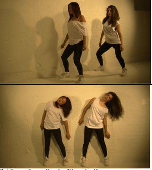
Eleni, Yasmeen, Samarge, Karen from 283goswell on Vimeo.
How to make a gif

Here I am taking about the kind of fonts are used and why. I believe these fonts that I have used are very stylist, and also attractive. its not just boring old fonts. Its bold standing out, eye catching. During my feedback time i asked a lot of people about what they think about my font and I got a lot of positive, hardly any negative, i am happy with the font I chose. A lot of artists like Jamie foxx CD fonts inspired. White clothing was used through out my digi pack (poster, CD cover) and also part of my music video. The colour white has a lot of connations like purity, pure, clear etc. The reason why we have decided to use the colour white is because we believed it would work well in the music video with the white background and also it would be a good contrast. The dancers also wear white, it matches the artist and also the white background. As you can see my poster (on the left) the white shirt and the creamy white background of the poster. My CD cover and poster are the same image. One of the reasons why I have done this is because I believe having similar images or certain clothing maybe recongised by 'Angelo' fans, as we are here to promote his CD and himself. Like a lot of artist do they use images that they have in there video and advertise it just like Calvin harris. Calvin harris is an example of using the same CD image he used in his video and also used for his CD cover. The open shirt of the body i believe would appeal to a lot of females and also gay males (the white works well with this as well)
 Here is an example of a CD cover and also a shot of Calvin Harris video, here he is promoting the song and the CD, as there is same images of the CD that he used in the video and also used the same for his CD cover, the reason why he used the same mise-en-scene background is because he wants it to be recongiseble so that the auidence know who the artist is. This is a way of promoting the artisit and also the CD and also music video. These two images are screen shot that I took from the video to show how he used the same mise-en-scene through out and also the disc as the cover of his CD cover. He also used female too.
Below you can see Calvin Harris CD cover. You can see he used the same mise-en-scene as the music video he used. He used a lot of of females and for his CD cover here he has used one of the females wearing shades. The same colours are used aswell.
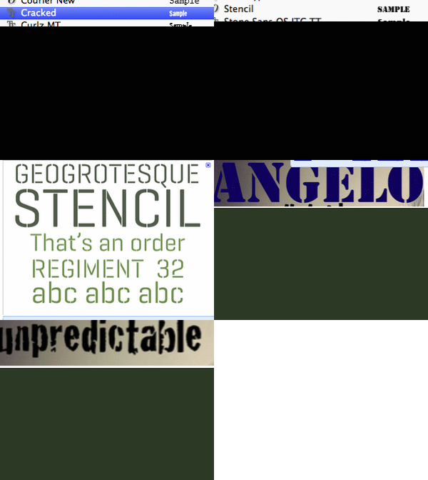
The fonts that I have used. As you can see the fonts that i have used for the poster and also CD cover. A font can sometimes tell a lot about the artist. My font is not too girly or too manly. Its just a normal attractive font. When I recieved a lot of feedback the first positive comment I got was about my font, how attractive it was and appealing. The unique font I used (shown below of the font) I believe would be up to a lot of peoples taste.
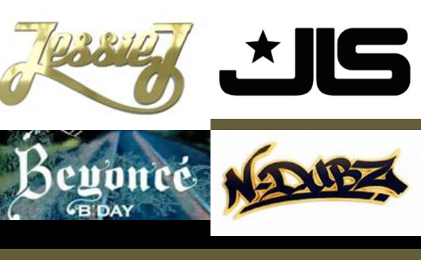
 Create a gif The font I have used is "Cracked" and "Stencil". I used the same font for my poster as well as i want the writing to be recongiseable like a lot of artists names are 'N-duds" "Jessie J" they always use the same colour and font so its recongisable.
Make gif


No comments:
Post a Comment