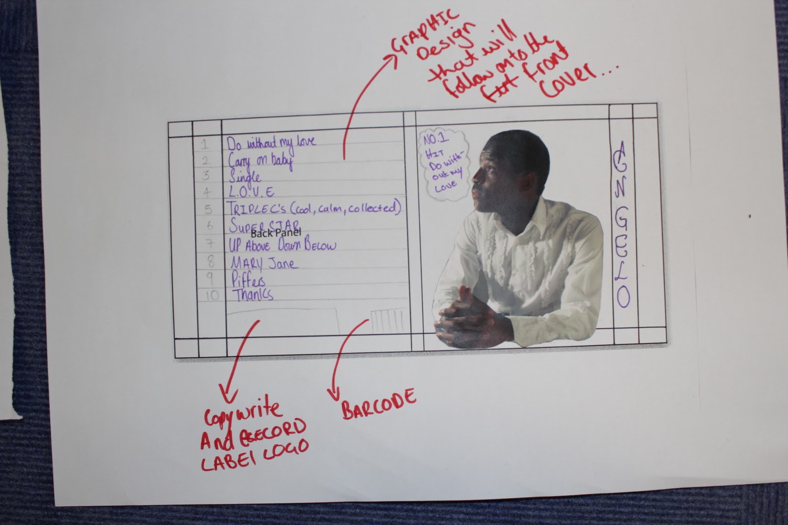
We plan to make a professional and genuine digipak, but in order for us to do this to the best of of our ability the teachers gave us a couple of guidelines we should follow in order for it too look professional and slick but realistic and genuine.
Do's
- Use clear fonts and photos in an appropriate size/shape.
- Use a layout that follows the rule of thirds for composition.
- Appropriate font that follows genre conventions; position text to conform to conventions.
- Follow the three colour rule and choose colours that are appropriate for images, font and backgrounds.
- Think carefully about how you use and intergrate images, font, text and language. (anchoring meaning putting images with text).
- Use approprate industry logos, conventions properly positioned.
Dont's
- Stretch images.
- Use Layer styles.
- Use effects that do not fit the genre.
- Place text across artists face.
- Use a font because you 'like it'.
- Feel the need to use separate images on each panel.
Personally, I think this has helped because I can now structure my work professionally and hopefully get top marks for my creative work. I think what was also really helpful is that the guidelines really have a clear focus on how you should produce your work which helps to strengthen your work because you can take a basic, structured idea, and develop it into something that you can be proud of.