Friday, 16 December 2011

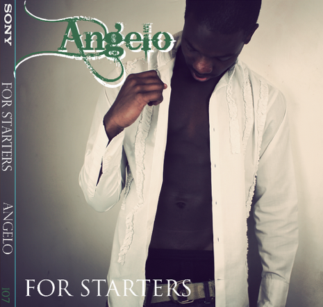
Inside of my digipak.


Today on the last day of college before winter holidays i finally finished my digipak inside, back and front panels, a 3 panel album. I have decided that the colour scheme is green and yellow, white and black, something simple and sophisticated. I included a close up of samarge, a body shot and the middle CD image is one linked to the front panel, an image of him holding roses. This follows the theme of romance, love and vulnerability. Even though our genre is hiphop and soft r&b, we wanted to steer away from the hard grime genre, as our song is soft and mellow. We picked the name 'Angelo' because its authentic, different and can relate to a lot of different cultures. I used the website 'rollip.com' to create a classic, antique effect on our photos, which we took in our photography studio.


  • Important: The album track list almost always appears to be on the outside panel adjacent to the front cover. Intertexuality is a key feature to consider when composing a digipak, as the image and font often links it to merchandise and other promotional material in order to create familiarity with the audience. There is a close relationship between the digipak design and the target audience. The digipak design usually relates directly to the genre of music, and there are identifiable generic conventions in each example.

Thursday, 15 December 2011

Showing Where My Ideas Came From Existing Products


In this poster right here you see the tour dates which I plan to put on my poster because i would want my fans to know when I will be singing the songs from the album. Also to put it on so they know im trying to establish myself in the industry and they can come and support.


 On there poster there are loads of logo's I plan to put logo's on my poster as well such as itunes and amazon and hmv places where I can   


My digipak so far.


Ideas for digi pack

On the mac i did a lot of researched about fonts and covers, Jamie foxx helped me a lot about fonts and style as you can see I have decided to use his font and turn it into my own style  
Here I am adding all the vital things that are needed but one important conventional I forgot about is the details and websites i completely forgot to add

Overview of Do's and Dont's

We plan to make a professional and genuine digipak, but in order for us to do this to the best of of our ability the teachers gave us a couple of guidelines we should follow in order for it too look professional and slick but realistic and genuine.

Do's
  1. Use clear fonts and photos in an appropriate size/shape.  
  2. Use a layout that follows the rule of thirds for composition.
  3. Appropriate font that follows genre conventions; position text to conform to conventions.
  4. Follow the three colour rule and choose colours that are appropriate for images, font and backgrounds.
  5. Think carefully about how you use and intergrate images, font, text and language. (anchoring meaning putting images with text).
  6. Use approprate industry logos, conventions properly positioned.

Dont's
  1. Stretch images.
  2. Use Layer styles.
  3. Use effects that do not fit the genre.
  4. Place text across artists face.
  5. Use a font because you 'like it'.
  6. Feel the need to use separate images on each panel.

Personally, I think this has helped because I can now structure my work professionally and hopefully get top marks for my creative work. I think what was also really helpful is that the guidelines really have a clear focus on how you should produce your work which helps to strengthen your work because you can take a basic, structured idea, and develop it into something that you can be proud of.

Wednesday, 14 December 2011

Inspirational Digipaks.

These Digipaks have been inspiration for me when making my own digipak. I have followed my own colour scheme from green, yellow and white and black. Rhianna for example has a red colour scheme and David Guetta has a grey and pink colour scheme. I have decided to create 3 panel digipak as i was so happy with our photos.


Tuesday, 13 December 2011

Font for digipak.


I have downloaded the font under 'fancy' category called "western" as it is cool, sophisticated and decorative but not too over the top at the same time.

Layout and designs ideas


A 'strokes' design that that stands out using just colours and rainbows.


Another design this time its all graphics and this one approach I could use.


This is a design with graphics and artist face.

Fonts and Colours Ideas

Fonts are very important because you want the audience to be able to read what is said. 
I only visited two sites to do fonts research, they where Dafont and 1001 fonts 


This is 1001 fonts where you have multiple fonts and as it says in its name it has 1001 fints to choose from so i have many fonts to pick from that could go with genre and readable. 


Another site that offers a load of fonts for me to choose from that have different themes and style types that can go with my genre.


Colours are really important as well  because if the colour is wrong people will not want to look at it plus if the colour is wrong you wont be able to read the information properly. 


Here there are the many colours however they have to work together you cant just put any two or three colours together. 


A wordle that includes name of fonts colours and shades. 


Digi pack PLANNING


Here is my start on the digi pac already I have struggled with the font and were to place it

Digipak 3D Mock Up


Digipack Planning


Monday, 12 December 2011

planning

 To help us with the digi pack we recieved infromation onto what should be done and shouldnt be done
 Here am looking at an old student digi pack and writing the strength and weaknesses


3 album that inspired me

One male album that inspired me a lot is Jason Derulo. His album cover is clear and recongiseable. Its name is clearly written and his face is the front cover


Justin Timberlake is another simple album cover. I would like to keep mine simple and neat like Justin Timberlake and also like Justin Biebers

JT and his Love Sounds